A funny thing happened on the way to the printer
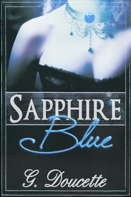
New new Sapphire Blue cover
As you all know, I recently revealed the cover design for Sapphire Blue. It was a glorious, naive time, before I knew about things like RGB and CMYK and what is wrong with the color blue. A time of peace. A time about a week and a half ago.
Okay, so here’s what’s going on. The cover was designed using a process called RGB which stands for I-Don’t-Know-What-It-Stands-For. This process is common for Internet images. The printer–a new printer for the publisher, connected with a new distributor for that publisher and more on that later because it’s awesome— is using CMYK, which stands for Like-I-Even-Know. This is common in printed works.
RGB begins with a white page and adds colors to it. CMYK begins with black and adds colors to it. This means certain colors that look lovely in RGB don’t look good at all in CMYK.
Specifically? The color blue is a thing.
Unsurprisingly, a book called Sapphire Blue has some blue on the cover.
Several iterations
I’ve been going back and forth with the artist, trying to get an image that looks like the one I’ve already shared with you to come out in CMYK. The results alternated between almost-kinda-there to *horrified shriek*, but the closest we came still left us with something where the blue coloration from the gemstone looked artificial and kind of photo-negative-ish.
So my last suggestion was to give up on the super-glowey part of the cover and see how things went with just the gemstone, and scene. Here is what we came up with: the new new cover for Sapphire Blue.

RGB means red, green, blue, and all the available color combinations are made from various mixtures of those 3. CYMK = cyan, yellow, magenta, and black, and all the colors etc. I think with CYMK you should have a better chance of a deep rich blue … but then, we are usually focusing on a logo that has a purple and a red in it so our problem child is the red.
I’m surprised you’re having such a problem. If you’re using software like Illustrator or Photoshop, you can switch between RGB and CMYK with few issues. Sometimes it does affect the color outcome. If you have a graphic designer who knows what they’re doing, they can compensate.
But the biggest thing to keep in mind is to proof the picture in the right format. RGB is meant to be displayed on a screen. CMYK is meant to be printed on paper.
And FYI, RGB is red, green, blue. If you have a light source that produces those three colors of light you can mix them to create all other colors of light. Your tv screen uses RGB. Your computer screen uses RGB. Rainbows can be created with RGB.
CMYK stands for the four colors of ink needed for printing full color pictures. Cyan, magenta, yellow, and black inks can be mixed to approximate all other colors.
You want a tutorial on keylining vector art next? *cheesy grin*
If you saw what the direct conversion from RBG to CMYK looked like, you’d be redesigning too…
I forgot to mention spot colors in printing. If you have a very specific shade of a color that you want to be consistent across the entire print run, you can use a spot color. This is a pre-mixed ink that is that specific color. It adds another mask to the print run (and can boost the cost depending on the set-up) but it will get you that shade of blue that you really really want.
I know I’m a bit late to the game, here. I really like the cover, except your signature looks a tad girly. Just my humble opinion. Thanks. 🙂